Table of Contents
- The Legal Case: Why Retail Stores Must Comply
- ADA Signage Requirements for Retail Stores: What You Need
- ADA Sign Mounting Height and Location: Getting Placement Right
- Benefits of Accessible Retail Design: Beyond Compliance
- Design Standards That Make Your Signage Work
- Digital-Physical Integration and Maintenance Planning
- Budgeting for Retrofitting and Multi-Language Accessibility
- Conclusion
- Frequently Asked Questions
Last Updated: September 26, 2026
The Legal Case: Why Retail Stores Must Comply
ADA compliant signage is a legal requirement, not an optional upgrade: a store that cannot be navigated independently excludes customers by design. The Americans with Disabilities Act sets federal standards for accessible design in places of public accommodation, and retail stores fall inside that definition.
Federal Regulations and Civil Rights Protections
Accessible signage sits under the ADA’s civil rights framework, which prohibits discrimination on the basis of disability in places open to the public. The ADA Standards for Accessible Design govern how signs must be designed, mounted, and finished. That means raised characters, Braille, and specific contrast requirements are not suggestions, they are enforceable specifications.
Non-Compliance Penalties and Legal Liability
Penalties can include civil penalties, mandatory remediation deadlines, and private legal action, with amounts and timelines depending on the violation and jurisdiction. Remediation almost always costs more than building it right the first time, because you pay for removal, patching, and reinstallation on top of the original signage.
ADA Signage Requirements for Retail Stores: What You Need
ADA signage requirements for retail stores cover tactile characters, Braille, visual contrast, and placement along the path of travel. Compliance depends on getting all four right.
Tactile Characters, Braille, and Visual Standards
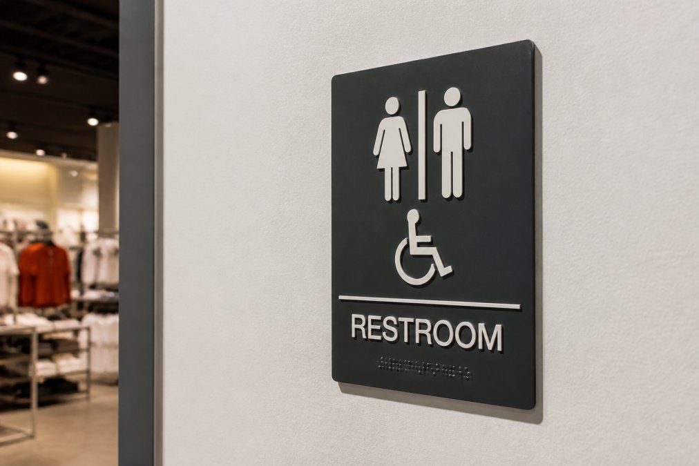
Tactile characters are raised letters and numbers that a person can read by touch, and they must meet defined rules for character proportion, stroke thickness, and sans-serif font selection. Braille must accompany the tactile text and be positioned consistently. High-contrast, non-glare finishes matter here: a glossy sign that reflects overhead lighting is technically present and functionally useless. The [U.S.
Key Areas Requiring Accessible Signage
Not every sign in a store needs tactile treatment, but these do:
- Restroom entrances, including restroom accessibility designations
- Fitting room compliance signage at each room
- Exit routes and directional signage toward accessible paths
- Permanent room and space identification signs
- Elevator and stairwell identification where applicable
| Area | Sign Type | Must Include |
|---|---|---|
| Restrooms | Permanent room sign | Tactile text, Braille, pictogram |
| Fitting rooms | Room identification | Tactile text, Braille |
| Exits | Directional signage | High-contrast visual text |
| Elevators | Space identification | Tactile text, Braille, floor level |
ADA Sign Mounting Height and Location: Getting Placement Right
ADA sign mounting height and location requirements exist so a seated or standing person can reach and read a sign without assistance. Height is measured from the finished floor to the baseline of the lowest tactile character.
Mounting Height Rules and Reach Ranges
Signs with tactile characters must be mounted so the tactile baseline falls within the reach range specified by the standards, typically on the latch side of a door. A common mistake is centering a sign on the door itself, forcing a person to move out of the swinging door’s way to read it.
Path of Travel and Clear Floor Space
Clear floor space matters as much as the sign. If a display rack, promotional bin, or seasonal endcap blocks the wall where your sign is mounted, the sign is compliant on paper and obstructed in practice. Walk the path of travel with a tape measure before signing off.
The most common retail compliance failure we see is a compliant sign mounted in a blocked location. A sale rack parked in front of a restroom sign turns a passing inspection into a violation, and inspectors check reachability, not just specifications.
Benefits of Accessible Retail Design: Beyond Compliance
The benefits of accessible retail design extend past the inspection sheet: clearer wayfinding, broader market reach, and a brand that reads as genuinely inclusive.
Improved Customer Experience and Wayfinding
Good directional signage reduces how often customers ask employees where something is, freeing staff and shortening the shopping trip. Wayfinding that works for a person with visual impairment also works for a first-time visitor, a parent with a stroller, and anyone in a hurry. Universal design is better design for everyone.
Broader Market Reach and Brand Inclusivity
An accessible store welcomes customers who might otherwise shop elsewhere or abandon a trip entirely. That reach compounds across a multi-location footprint, where consistency in signage is also consistency in brand. Our teams install across the region for exactly this reason, and clients who treat signage as part of the customer experience rather than a legal checkbox often see the difference.
Design Standards That Make Your Signage Work
Design standards determine whether a sign functions or just exists. The ADA Standards for Accessible Design set numeric criteria for character proportion, stroke thickness, font selection, and finish reflectivity, and a sign that fails one criterion can fail the whole installation.
Character and Braille Specifications
Tactile characters must be raised a minimum of 1/32 inch above the sign surface, and they must be sans-serif with a stroke thickness between 10% and 15% of the character height. Character height is tied to viewing distance: close-approach signs typically use characters between 5/8 inch and 2 inches tall, with the most common retail range around 5/8 inch to 1 inch for room identification.
Contrast, Finish, and Pictogram Rules
Visual contrast between characters and background must be at least 70%. A sign with 50% contrast can be technically present and functionally unreadable for a person with low vision. Finish must be matte or non-glare so overhead lighting does not wash out the characters.
A Practical Pre-Installation Review
Before any ADA sign goes on the wall, run it through this review:
- Tactile characters are raised at least 1/32 inch and readable by touch
- Braille is Grade 2, dome-shaped, and positioned below the tactile text
- Visual contrast between text and background is at least 70%
- Finish is matte or non-glare, not reflective
- Font is sans-serif with stroke thickness between 10% and 15% of character height
- Pictograms are at least 6 inches tall with a contrasting border
- Mounting height is verified with a tape measure from the finished floor to the tactile baseline
- Clear floor space in front of the sign is unobstructed
Specify a matte or non-glare finish on every ADA sign, even when the rest of your interior graphics use gloss. Mixing finishes across a store looks inconsistent, but a reflective ADA sign is a functional failure regardless of how it photographs. If your brand standard calls for gloss, apply it to non-tactile graphics only and keep the tactile signs matte.
Where Design Standards and Brand Standards Collide
The tension most retail operators hit is between a brand palette and the contrast rule. A light gray character on a white background may look elegant in a brand book, but it will not clear 70% contrast. The practical resolution is to keep the compliant sign as the primary identifier and use brand-colored accents on adjacent non-tactile graphics, so the store still reads as on-brand without compromising the sign that must function by touch and by low-vision reading.
Digital-Physical Integration and Maintenance Planning
Most retail signage guides stop at installation. That is where the real risk begins. Tactile signs degrade, get painted over, get relocated during remodels, and fall out of sync with digital directories. It is the gap where compliance quietly erodes between inspections.
The Maintenance Liability No One Talks About
Braille dots are the most fragile element on any ADA sign. Raised a fraction of an inch above the surface, they can flatten or wear down from repeated cleaning with abrasive pads, harsh chemicals, or pressure washing. A flattened Braille dot is a functional failure a person reading by touch will notice immediately.
Keeping Digital and Physical Signage in Sync
Digital directories, wayfinding kiosks, and mobile apps are usually managed by marketing or IT, while physical ADA signs are managed by facilities. That split is how a store ends up with a digital directory pointing to a relocated restroom while the tactile sign still marks the old location.
A Lifecycle Plan That Actually Holds Up
Compliance is not a one-time event but a state maintained across remodels, staff turnover, and years of cleaning. A workable lifecycle plan assigns an owner and a frequency to each task:
| Task | Frequency | Owner |
|---|---|---|
| Visual walk-through of all ADA signs | Quarterly | Facilities |
| Tactile and Braille wear inspection (touch test) | Semi-annually | Facilities |
| Full signage audit with measurements | Annually | Facilities or vendor |
| Update after any remodel or relocation | Per project | Project manager |
| Digital directory sync check | Quarterly | Marketing |
| Cleaning protocol review | Annually | Facilities |
When to Repair vs. Replace
Not every worn sign needs replacement. A sign with minor surface scuffing but intact tactile characters and Braille can often stay. A sign with flattened Braille, filled-in characters, or a finish that has become reflective needs replacement, because those elements carry the compliance.
Budgeting for Retrofitting and Multi-Language Accessibility
Retrofitting costs depend on how many signs need replacement, how much wall repair is required, and whether the layout must change to restore clear floor space. Pricing depends on quantity, materials, and site conditions, so a quote beats an estimate every time.
Budget for signage as a line item in the original renovation scope, not as a change order. Retrofitting after the walls are finished costs more, takes longer, and usually delays the opening.
Conclusion
Getting ADA compliant signage right across a multi-location footprint is harder than it looks, and the details that matter most, mounting height, reach ranges, and clear floor space, are the easiest to get wrong. Triton Sign brings over 30 years of combined sign and display experience to design, fabrication, and installation, with a track record of meeting tight construction deadlines and budget constraints.
Frequently Asked Questions
Do retail stores have to be ADA compliant?
Yes. Under the Americans with Disabilities Act, retail stores are places of public accommodation and must meet accessibility standards, including signage. This covers tactile signs with raised lettering and Braille at restrooms, fitting rooms, exits, and other key areas. Non-compliance can lead to civil rights complaints, legal liability, and penalties. Compliance is not optional and applies to new construction, renovations, and existing facilities that serve the public.
What are the ADA signage requirements for retail stores in 2026?
ADA signage requirements for retail stores include tactile characters, Grade 2 Braille, high-contrast finishes, non-glare surfaces, and specific mounting heights. Signs must use sans-serif fonts with proper stroke thickness and character proportion. Permanent room signs need raised lettering and Braille. Directional and wayfinding signs should have pictograms and clear visual contrast. Requirements apply to restrooms, fitting rooms, exits, and any permanent space identification.
Where is ADA signage required in a retail environment?
ADA signage is required at permanent room entrances like restrooms, fitting rooms, offices, and exit doors. Directional signage is needed where the path of travel is not obvious. Signs must be placed on the wall adjacent to the door on the latch side, with mounting height between 48 and 60 inches from the floor to the baseline of the tactile characters. Clear floor space must be available at the sign location for a person using a wheelchair to approach.
How does ADA signage improve the customer experience?
Accessible signage improves wayfinding for everyone, not just people with visual impairments. Clear, high-contrast signs with tactile elements help shoppers navigate stores faster, find restrooms and fitting rooms easily, and feel welcome. Inclusive design signals that your brand values all customers, which builds loyalty and broadens your market reach. When signage is consistent and well-placed, it reduces frustration and creates a smoother shopping experience for all visitors.