Table of Contents
- What ADA Compliant Signage Actually Requires
- ADA Sign Character Size and Font Standards
- Contrast, Finish, and Pictogram Requirements
- ADA Signage Mounting Height Requirements
- ADA Signage Placement Checklist for Office Buildings
- Multi-Language Signage, Budgeting, and Maintenance
- Digital vs. Physical ADA Compliant Signage
- Frequently Asked Questions
Last Updated: August 29, 2026
What ADA Compliant Signage Actually Requires
ADA compliant office signage requirements exist because accessible signage isn’t optional, it’s federal law. The Americans with Disabilities Act, enforced through the ADA Standards for Accessible Design, mandates specific technical standards for signs in places of public accommodation and commercial facilities. The most common mistake is treating all office signs the same way, they’re not. The ADA draws clear lines between different sign types, and those lines determine which technical standards apply.
The core principle: signs that identify permanent rooms and spaces must meet the most rigorous ADA standards, including tactile characters and Grade 2 Braille. Signs that are directional, informational, or temporary operate under a lighter set of rules.
Which Signs Must Be ADA Compliant
Not every sign in your office triggers full ADA compliance requirements. The law focuses on signs that identify permanent spaces: restrooms, conference rooms, offices, stairwells, and exits. These require tactile characters, Braille, specific mounting heights, and contrast requirements.
Signs that provide direction (“Lobby →”), display hours of operation, or identify non-permanent spaces don’t require tactile characters or Braille. Overhead and suspended signs follow different rules, they require visual character compliance but not tactile elements.
The practical checklist is straightforward:
- Does it identify a permanent room or space?
- Is it mounted on a wall (not overhead or suspended)?
- Will the space remain in use indefinitely?
If you answer yes to all three, full ADA standards apply.
Permanent Room Identification vs. Directional Signage
Permanent room identification signs designate rooms and spaces that don’t change function, “Room 204,” “Women’s Restroom,” or “Fire Stair.” These require tactile characters, Grade 2 Braille, pictograms where applicable, and strict mounting location rules.
Directional signage guides people through a space but doesn’t name a permanent room. These must meet visual character standards for legibility but are exempt from tactile and Braille requirements. Permanent room signs cost more to produce correctly and must be right from day one.
ADA Sign Character Size and Font Standards
Character size and font standards are where many sign vendors cut corners. The ADA Standards for Accessible Design are specific, this isn’t a matter of “close enough.”
Tactile Characters and Grade 2 Braille Specifications
Tactile characters are raised letters and numbers that can be read by touch. The technical specifications are precise:
- Character height: Between 5/8 inch and 2 inches
- Relief: Characters must be raised at least 1/32 inch from the sign surface
- Font: Uppercase sans-serif or simple serif. No decorative, italic, or condensed fonts
- Stroke width: Between 10% and 30% of character height
- Spacing: Characters must be separated by at least 1/8 inch between edges
Grade 2 Braille is the contracted form used in ADA signage, not Grade 1. It must be positioned directly below the corresponding text, with the first cell beginning no more than 3/8 inch below the baseline of the last line of raised characters. Braille dots must be domed with a diameter between 0.059 and 0.063 inches and a height between 0.025 and 0.037 inches.
Using Grade 1 Braille instead of Grade 2 is one of the most common ADA signage violations. It’s invisible to visual inspection, which means it often slips through until a formal audit surfaces the issue.
Visual Character Height, Stroke Width, and Spacing
Visual characters have their own size requirements based on mounting height. According to the ADA Standards for Accessible Design Section 703, the minimum character height for signs mounted with the baseline at 40 to 70 inches above the floor is 5/8 inch. For signs mounted higher, the minimum height increases proportionally.
| Specification | Requirement |
|---|---|
| Minimum character height (40-70″ mounting) | 5/8 inch |
| Stroke width | 10%-30% of character height |
| Font style | Sans-serif preferred; no italics |
| Contrast | Light on dark or dark on light |
Character spacing must be between 10% and 35% of character height. Line spacing must be 135% to 170% of character height.
Contrast, Finish, and Pictogram Requirements
Visual contrast between characters and background must be light-on-dark or dark-on-light. A significant tonal difference is required, medium gray on slightly lighter gray will fail inspection. Black on white or white on dark blue are safe choices.
Non-glare finish is mandatory. Glossy or semi-gloss surfaces reflect light in ways that obscure characters for people with low vision. Matte or eggshell finishes are standard.
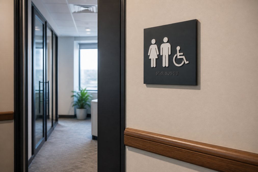
Pictograms are required on certain signs, restrooms being the most common. When used on permanent room identification signs, the ADA requires:
- A pictogram field at least 6 inches in height
- A text descriptor directly below the pictogram field
- The text descriptor must meet all tactile character requirements
- The pictogram itself does not need to be raised, but the text descriptor does
When specifying restroom signs, the pictogram field and tactile text below it are separate elements with separate compliance requirements. A sign that gets the pictogram right but places the Braille in the wrong position will still fail.
ADA Signage Mounting Height Requirements
ADA signage mounting height requirements are among the most cited compliance failures in office environments, and they’re straightforward to get right if you know the rules before installation.
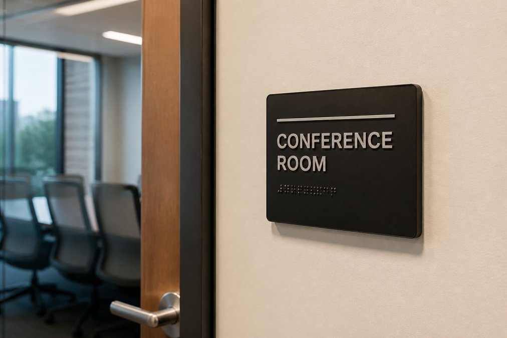
The baseline rule for permanent room identification signs: the centerline must be mounted at 60 inches above the finished floor. The tactile characters must be located between 48 inches and 60 inches above the finished floor, measured from the baseline of the lowest tactile character.
Clear Floor Space and Reach Range Rules
Clear floor space is often overlooked during installation planning. The ADA requires an unobstructed floor space of at least 18 inches by 18 inches in front of any sign requiring tactile reading. This space must not be blocked by furniture, door swings, or other obstructions.
For a forward reach from a wheelchair, the maximum high reach is 48 inches and the minimum low reach is 15 inches. Tactile sign placement within the 48-60 inch window satisfies both standing and seated reach requirements.
Installation location is equally regulated. Permanent room identification signs must be mounted on the latch side of the door, not the hinge side or centered on the door itself. If no wall space exists on the latch side, the sign may be mounted on the nearest adjacent wall. The sign must be positioned so a person can approach within 3 inches of the sign face without encountering a door swing.
ADA Signage Placement Checklist for Office Buildings
A compliance checklist is the most practical tool for facility managers and project managers. The following consolidates core placement and specification requirements.
Permanent Room Identification Signs:
- Sign is mounted on the latch side of the door
- Centerline of sign is at 60 inches above finished floor
- Tactile characters are between 48 and 60 inches above finished floor
- 18″ x 18″ clear floor space is unobstructed in front of sign
- Sign is not mounted on the door itself
- Sign placement allows approach within 3 inches without door interference
Character and Braille Specifications:
- Raised characters are uppercase sans-serif
- Character height is between 5/8 inch and 2 inches
- Characters are raised at least 1/32 inch from the surface
- Grade 2 Braille is used (not Grade 1)
- Braille is positioned directly below the corresponding text
- Braille cells begin no more than 3/8 inch below the last text baseline
Finish and Contrast:
- Sign surface has a non-glare, matte finish
- High contrast between characters and background
- Pictogram field is at least 6 inches in height (where applicable)
- Text descriptor accompanies all pictograms
Directional and Overhead Signs:
- Visual characters meet minimum height requirements for mounting height
- Stroke width is within 10%-30% of character height
- Font is sans-serif with no decorative or italic styles

Running this checklist before installation, not after, is the difference between a compliant project and an expensive retrofit. ADA signage corrections on a completed build cost significantly more than getting specifications right at fabrication.
Multi-Language Signage, Budgeting, and Maintenance
The ADA Standards don’t mandate multi-language signage, but other regulatory frameworks make it worth addressing in compliance planning.
Multi-Language Compliance Considerations
Federal law under the ADA focuses on accessibility for people with disabilities, not language access. However, the U.S. Department of Justice guidance on language access requires recipients of federal financial assistance to provide meaningful access to people with limited English proficiency. For healthcare facilities, government offices, and organizations receiving federal funding, this creates a parallel compliance obligation alongside ADA requirements.
The practical challenge with multi-language signage is maintaining ADA compliance across all language versions. Each language version of a permanent room identification sign must independently meet all ADA technical standards: tactile characters, Grade 2 Braille (in English), non-glare finish, and correct mounting.
A common approach for multi-language environments is to use the English ADA-compliant sign as the primary permanent room identification sign and supplement it with additional visual-only signage in other languages. This keeps the ADA-compliant sign clean and avoids visual complexity.
Procurement Tips and Budget Planning
Budgeting for ADA signage requires understanding the full scope before fabrication begins.
Audit first, specify second. Count every permanent room, restroom, stairwell, and exit before writing a specification. Missing signs discovered after installation are expensive to add.
Batch orders reduce unit cost. Ordering all signs for a project at once typically reduces per-unit cost and ensures consistency across the building.
Specify materials for the environment. Restroom signs need moisture-resistant substrates. Exterior-facing signs need UV-stable finishes. Specifying the wrong material leads to premature failure and replacement costs.
Inspection and Maintenance Schedules
A practical maintenance schedule includes:
- Annual visual inspection: Check for physical damage, fading, delamination, and loose mounting hardware
- Tactile character check: Verify raised characters haven’t been worn down; Braille dots should remain domed and intact
- Mounting verification: Confirm signs remain at the correct height and location
- Replacement trigger: Any sign with damaged Braille, missing characters, or compromised contrast should be replaced
Signs in high-traffic areas degrade faster than those in low-traffic corridors. Building that reality into replacement budgeting is essential.
Digital vs. Physical ADA Compliant Signage
Digital signage is increasingly common in office environments. The question of whether a digital display can satisfy ADA requirements comes up regularly. The short answer: digital signs can satisfy some ADA requirements, but not the tactile and Braille requirements for permanent room identification.
The ADA requires tactile characters and Grade 2 Braille on permanent room identification signs. A digital display cannot provide raised characters or physical Braille dots. Digital displays cannot replace ADA-compliant physical signs on permanent room identification applications.
Where digital signage works well in an ADA compliance framework:
- Directional and wayfinding signage: Digital displays can replace static directional signs, provided they meet visual character contrast and legibility requirements
- Room scheduling displays: Tablet-based room booking displays are supplementary to, not replacements for, the permanent ADA sign on the latch side of the door
- Informational displays: Lobby directories, event listings, and hours of operation can be digital without triggering tactile requirements
The U.S. Access Board technical guidance on signage clarifies which sign types require tactile elements. For facilities integrating digital and physical signage systems, the practical rule is: if the space is permanent, the physical ADA sign stays. Digital supplements it; it doesn’t replace it.
Getting ADA signage right requires precision at every stage: specification, fabrication, and installation. The most expensive mistakes aren’t caught during formal audits, they’re the ones requiring full replacement because original signs were built to the wrong standard.
Triton Sign brings over 30 years of combined experience to ADA signage projects, with full-service design, fabrication, and installation under one roof. Whether you’re managing a multi-floor new build or retrofitting an existing office, our team handles specification compliance, consistent branding across locations, and on-time delivery. Contact Triton Sign to get your ADA signage project scoped correctly from the start.
=== FAQ ANSWERS (audit these too, same rules) ===
[1] Q: Do all office signs need to be ADA compliant?
A: No. The Americans with Disabilities Act Standards for Accessible Design require ADA compliance only for signs that identify permanent rooms and spaces, think restrooms, stairwells, conference rooms, and exits. Temporary signs, menu boards, and overhead directional signs follow different or no tactile requirements. However, any sign visible to the public that identifies a permanent space should be evaluated against the applicable scoping requirements to avoid liability.
[2] Q: What are the specific font and character requirements for ADA signs?
A: Tactile characters must be raised at least 1/32 inch from the sign face, use a sans-serif font, and be uppercase. Character height for tactile text must be between 5/8 inch and 2 inches. Visual characters on overhead or directional signage have different height minimums based on mounting height. Stroke width must fall between 10% and 30% of character height, and character spacing must be between 10% and 35% of character height to maintain readability.
[3] Q: Where must ADA-compliant signs be mounted in an office?
A: Signs identifying permanent rooms must be mounted on the latch side of the door. The tactile characters must be located between 48 inches and 60 inches above the finished floor, measured from the baseline of the lowest tactile character. A clear floor space of at least 18 by 18 inches must be available in front of the sign so a wheelchair user can approach and read it. If there is no wall space on the latch side, the sign may be placed on the nearest adjacent wall.
[4] Q: What is the difference between tactile and visual characters in ADA signage?
A: Tactile characters are raised from the sign surface and paired with Grade 2 Braille so they can be read by touch. They are required on signs identifying permanent rooms. Visual characters are designed for sighted reading from a distance and must meet contrast, font size, and non-glare finish requirements. Some signs need both: a tactile panel at door height plus larger visual characters above or alongside it for easy viewing from further away.
[5] Q: Are there color contrast requirements for ADA-compliant signs?
A: Yes. ADA Standards require light characters on a dark background or dark characters on a light background, with a finish reflectivity difference of at least 70% between the character and the background. The sign surface must also use a non-glare finish to prevent reflections that reduce legibility. High-gloss laminates and polished metals typically fail this requirement unless the character contrast is sufficient and the surface is matte or eggshell.
[6] Q: What are the penalties for non-compliant office signage?
A: Under the ADA, the Department of Justice can investigate complaints and pursue civil penalties. First-time violations can result in fines up to $75,000, with subsequent violations reaching $150,000. Private lawsuits are also common, and plaintiffs can seek injunctive relief and attorney fees. Beyond fines, non-compliant signage can delay a certificate of occupancy on new construction, making early compliance planning far less costly than post-installation corrections.
[7] Q: Can digital screens replace physical ADA-compliant signs?
A: Digital screens can supplement wayfinding and directional signage, but they cannot replace tactile signs for permanent room identification. The ADA requires physical raised characters and Grade 2 Braille on signs identifying permanent spaces, a screen cannot replicate that tactile function. Digital displays are useful for directories, maps, and changeable information, but every permanent room still needs a compliant physical sign on the latch side of the door.
Frequently Asked Questions
Do all office signs need to be ADA compliant?
No. The Americans with Disabilities Act Standards for Accessible Design require ADA compliance only for signs that identify permanent rooms and spaces, think restrooms, stairwells, conference rooms, and exits. Temporary signs, menu boards, and overhead directional signs follow different or no tactile requirements. However, any sign visible to the public that identifies a permanent space should be evaluated against the applicable scoping requirements to avoid liability.
What are the specific font and character requirements for ADA signs?
Tactile characters must be raised at least 1/32 inch from the sign face, use a sans-serif font, and be uppercase. Character height for tactile text must be between 5/8 inch and 2 inches. Visual characters on overhead or directional signage have different height minimums based on mounting height. Stroke width must fall between 10% and 30% of character height, and character spacing must be between 10% and 35% of character height to maintain readability.
Where must ADA-compliant signs be mounted in an office?
Signs identifying permanent rooms must be mounted on the latch side of the door. The tactile characters must be located between 48 inches and 60 inches above the finished floor, measured from the baseline of the lowest tactile character. A clear floor space of at least 18 by 18 inches must be available in front of the sign so a wheelchair user can approach and read it. If there is no wall space on the latch side, the sign may be placed on the nearest adjacent wall.
What is the difference between tactile and visual characters in ADA signage?
Tactile characters are raised from the sign surface and paired with Grade 2 Braille so they can be read by touch. They are required on signs identifying permanent rooms. Visual characters are designed for sighted reading from a distance and must meet contrast, font size, and non-glare finish requirements. Some signs need both: a tactile panel at door height plus larger visual characters above or alongside it for easy viewing from further away.
Are there color contrast requirements for ADA-compliant signs?
Yes. ADA Standards require light characters on a dark background or dark characters on a light background, with a finish reflectivity difference of at least 70% between the character and the background. The sign surface must also use a non-glare finish to prevent reflections that reduce legibility. High-gloss laminates and polished metals typically fail this requirement unless the character contrast is sufficient and the surface is matte or eggshell.
What are the penalties for non-compliant office signage?
Under the ADA, the Department of Justice can investigate complaints and pursue civil penalties. First-time violations can result in fines up to $75,000, with subsequent violations reaching $150,000. Private lawsuits are also common, and plaintiffs can seek injunctive relief and attorney fees. Beyond fines, non-compliant signage can delay a certificate of occupancy on new construction, making early compliance planning far less costly than post-installation corrections.
Can digital screens replace physical ADA-compliant signs?
Digital screens can supplement wayfinding and directional signage, but they cannot replace tactile signs for permanent room identification. The ADA requires physical raised characters and Grade 2 Braille on signs identifying permanent spaces, a screen cannot replicate that tactile function. Digital displays are useful for directories, maps, and changeable information, but every permanent room still needs a compliant physical sign on the latch side of the door.
This article was written using GrandRanker