Table of Contents
- Why Signage Visibility Determines Whether Customers Walk In
- 1. Use Contrast and Readability Standards to Make Your Sign Legible at Distance
- 2. Select Business Sign Lighting Options That Match Your Environment
- 3. Apply Signage Placement and Site Analysis for Maximum Viewability
- 4. Meet ADA Signage Requirements Without Sacrificing Brand Identity
- 5. Build a Visual Hierarchy That Turns Viewers Into Customers
- How to Track ROI and Measure Signage Impact on Business Visibility
- Conclusion: Turning Better Visibility Into Real Business Results
- Frequently Asked Questions
Last Updated: October 4, 2026
Why Signage Visibility Determines Whether Customers Walk In
Most businesses treat business signage as a formality. A name on a building. A box to check.
That thinking costs customers every day.
Business signage is the first handshake between a company and a potential customer, before a website loads, a call, or a review.
At Triton Sign, we’ve spent over 30 years of combined industry experience watching what separates signs that pull people in from signs that blend in.
Visibility is not about being the biggest sign on the block. It’s about being the clearest, best-lit, best-placed sign for the person most likely to walk through your door.
1. Use Contrast and Readability Standards to Make Your Sign Legible at Distance
Legibility starts with contrast: light text on dark, or dark on light. Never mid-tone on mid-tone, gray on beige disappears, navy on black vanishes.
Contrast Ratios and Color Choices That Survive Sunlight and Shadow
Aim for a contrast ratio of at least 4.5:1 between text and background, the digital accessibility standard (Understanding Success Criterion 1.4.3: Contrast (Minimum) | WAI). Color psychology matters too: red reads as urgent, blue as trustworthy, and yellow demands attention but fades fast in direct sun. Pick colors that serve both your brand and the viewing conditions.
Font Weight, Letter Height, and Viewing Distance
The general rule: 1 inch of letter height for every 10 feet of viewing distance. A sign read from 100 feet needs letters at least 10 inches tall. Thin, decorative fonts look elegant up close but turn to mush at 50 feet, use bold, sans-serif fonts for anything read at speed.
- Highway-speed viewing: 1 inch per 10 feet, bold sans-serif only
- Sidewalk viewing: 1 inch per 10 feet, medium weight works
- Close reading: decorative fonts acceptable
The biggest mistake we see is designers mocking up signs on a laptop screen. What looks sharp at 18 inches looks like a blur at 60 feet. Always test a full-size printout from the actual viewing distance before fabrication.
2. Select Business Sign Lighting Options That Match Your Environment
LED illumination uses front-facing lights to brighten the sign face, the most common choice for channel letters in high-traffic retail areas.
Halo lighting places LEDs behind the letters for a soft glow against the wall, reading as premium for professional offices and restaurants.
Backlit signs light the entire face from behind, best for box signs and large-format displays needing even brightness.
| Lighting Type | Best For | Typical Maintenance Interval | Visual Effect |
|---|---|---|---|
| LED front-lit | Retail, high-traffic | 50,000-100,000 hours to lumen depreciation | Bold, direct |
| Halo | Professional offices | 50,000-100,000 hours | Soft, premium |
| Backlit | Large displays | 30,000-50,000 hours; ballast or driver service more frequent | Even, bright |
Brightness, Color Temperature, and What Actually Reads at Night
Brightness is measured in nits (candelas per square meter). A common benchmark is roughly 100-300 nits per square foot of sign face, though a sign in a dark suburban corridor needs far less output than one competing with a brightly lit commercial strip.
Color temperature matters too. Warm white (2700-3000K) reads as inviting for restaurants and hospitality; cool white (5000-6500K) reads as clinical and high-visibility for medical offices, auto dealers, and retail. Mixing color temperatures creates a patchy look that undermines the brand.
Matching Lighting to Placement and Viewing Distance
Lighting decisions cannot be made in isolation from placement. A halo-lit sign that looks elegant from the sidewalk can disappear from a highway at 45 mph, while a front-lit channel letter sign can create glare that washes out the logo from an angle. Match the lighting type to the primary viewing distance and angle.
- Highway or arterial viewing (100+ feet): Front-lit or backlit, high output, bold letterforms. Halo lighting is usually too subtle.
- Street or parking lot viewing (30-100 feet): Front-lit or halo, moderate output. Halo works if the wall behind the sign is dark enough to create contrast.
- Sidewalk or entry viewing (under 30 feet): Any type works. Halo and backlit read as premium; front-lit reads as direct and promotional.
Efficiency, Longevity, and the Real Cost of Maintenance
LEDs dominate for good reason: they last longer, use less power, and hold brightness better than neon and fluorescent. That matters because sign maintenance is expensive and disruptive, a service call to replace a failed transformer or driver often costs more than the component itself, especially with a lift or bucket truck. Fluorescent and neon need more frequent lamp and ballast replacement and degrade faster; LED costs more upfront but delivers lower total cost of ownership.
Before you approve a lighting design, ask for a nighttime mockup or a photometric rendering, not just a daytime elevation drawing. What looks balanced in daylight can look uneven or blown out after dark, and lighting is the one sign element you cannot fix with a paint or vinyl change.
Digital Signage Integration: The Lighting Angle Most Guides Skip
If you are considering digital signage, LED displays, LCD screens, or e-paper, lighting strategy changes. Digital displays emit their own light, so the question shifts from “how do I illuminate the sign?” to “how do I keep the display legible against ambient light?”
Two practical considerations:
- Brightness matching: A digital display in a sunlit storefront needs significantly higher nits than one in a shaded interior. A common benchmark for outdoor-visible digital signage is 2,500-5,000 nits, while indoor displays often run 350-700 nits.
- Glare and reflection: A glossy digital screen facing a street with oncoming headlights or direct sun will reflect more than it displays. Matte or anti-glare surface treatments matter as much as raw brightness.
Static signs are lit; digital signs are light sources. Treating them the same way in the design phase is one of the most common and costly mistakes.
Do not assume a lighting upgrade is a simple swap. Changing from fluorescent to LED often requires a new transformer or driver, and in some cases a new sign can. Verify compatibility before ordering components, or you may pay twice.
3. Apply Signage Placement and Site Analysis for Maximum Viewability
Placement decides whether anyone sees your sign at all. Site analysis comes before design.
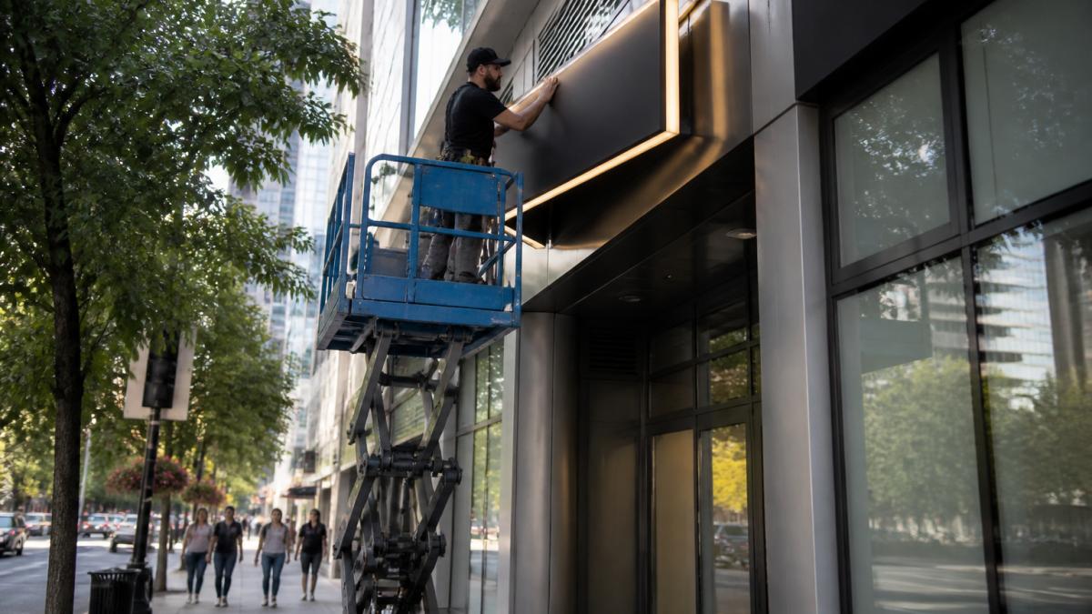
Viewing Angles, Foot Traffic Patterns, and Environmental Factors
Walk your property at different times of day. Note where foot traffic actually flows, how the sun hits the building, and what blocks the view from the street. Key factors to assess:
- Primary viewing angle: Where do most people approach from?
- Foot traffic patterns: Sidewalk flow, parking lot exits, transit stops
- Environmental factors: Trees, utility poles, neighboring signs, seasonal sun angles
Signage placement that ignores these factors wastes money. A beautiful sign facing the wrong direction is just an expensive wall decoration.
4. Meet ADA Signage Requirements Without Sacrificing Brand Identity
ADA signage requirements cover more than most business owners realize, applying to permanent room signs, directional signs, and signage identifying accessible features. The core rules are straightforward:
- Raised characters and Braille on permanent room signs (Chapter 7: Signs)
- Non-glare finish on the sign surface
- High contrast between characters and background
These requirements come from the ADA Standards for Accessible Design, which sets the federal baseline for accessible signage.
Here’s what most people miss: ADA compliance and brand identity are not in conflict. You can specify brand fonts that meet the standards and brand colors that pass contrast tests, the trick is choosing compliant options during design, not after fabrication.
Skipping ADA signage during a renovation means retrofitting later. That’s more expensive, more disruptive, and often delays your certificate of occupancy. Plan it into the initial scope.
5. Build a Visual Hierarchy That Turns Viewers Into Customers
Visual hierarchy is the order in which the eye reads a sign. Get it right, and viewers absorb your message in under two seconds.
Build hierarchy in three tiers:
- Primary: Brand name or logo, largest element
- Secondary: Core message or service, medium size
- Tertiary: Contact details, hours, website, smallest but still legible
Negative space is your friend, empty space around key elements makes them pop, and crowding kills legibility faster than any font choice. Use your strongest brand color for the primary element and neutrals for supporting text to guide the eye without conscious effort.
How to Track ROI and Measure Signage Impact on Business Visibility
Most articles claim a new sign will increase sales; almost none explain how to prove it. Measuring signage ROI requires three things: a baseline, a controlled comparison, and a way to attribute behavior to the sign rather than everything else happening in the business.
Step 1: Establish a Baseline Before Installation
You cannot measure impact without a before. In the two to four weeks before a new sign goes up, capture:
- Daily foot traffic counts: Manual counts during peak hours, or door sensor data if you have it. Record by day of week and time of day.
- Walk-in conversion rate: Of the people who pass your location, what percentage come in? A rough count of passersby versus entries is enough to start.
- Inquiry source data: Ask every new customer, “How did you hear about us?” and include signage as an explicit option. Most customers will not volunteer it unless asked directly.
Step 2: Isolate the Sign from Everything Else
The hardest part of signage ROI is attribution, since a new sign often coincides with a renovation, campaign, or seasonal uptick. To isolate the sign’s effect:
- Hold other variables steady: If possible, do not launch a major ad campaign in the same 30-day window as the sign installation.
- Use a control location: For multi-location businesses, install the new sign at one location first and compare performance against a similar location that did not get a new sign.
- Compare year-over-year, not just month-over-month: Seasonal traffic patterns can mask or exaggerate a sign’s impact. A 30-day post-install window compared to the same 30 days last year is more reliable than comparing to the prior month.
Step 3: Calculate the Return
The basic formula is straightforward:
Signage ROI = (Incremental Gross Profit from New Customers − Total Signage Cost) ÷ Total Signage Cost
Where:
- Incremental gross profit = (New customers attributable to the sign × Average gross profit per customer)
- Total signage cost = Design + fabrication + permits + installation + any electrical work
A worked example: if a new sign costs $8,000 all-in, and in the first year it brings in 200 additional customers with an average gross profit of $60 each, the incremental gross profit is $12,000.
These numbers are illustrative, not benchmarks, your figures depend on your margins, traffic, and market. The point is the method: without a baseline and a cost figure, you are guessing.
Metrics Worth Tracking Long-Term
- Foot traffic counts: Manual counts or door sensors, before and after install
- Customer surveys: “How did you hear about us?” with signage as an option
- Call tracking: Dedicated numbers tied to signage campaigns
For multi-location businesses, consistent measurement across sites shows which placements perform best, turning a one-time purchase into a repeatable, measurable channel.
The businesses that get the most from signage are the ones that treat it like any other marketing channel: with a cost, a baseline, and a measured return. A sign without measurement is a guess. A sign with measurement is an asset you can scale.
Conclusion: Turning Better Visibility Into Real Business Results
Better signage visibility is not a one-time project, it’s an ongoing asset that keeps working every day your doors are open.
Triton Sign handles design, fabrication, and installation as one process. We bring over 30 years of combined experience to every project, from ADA signage to custom exterior displays.
Ready to make your signage work harder? Contact us to start your project.
Frequently Asked Questions
How can I make my business sign more visible to passing traffic?
Focus on three factors: contrast, size, and placement. Use high-contrast color combinations like dark text on a light background, and size lettering so it is legible from the road at your typical vehicle speed. Position the sign perpendicular to the direction of travel so drivers see it head-on rather than at a sharp angle. Adding LED illumination extends visibility into evening hours and on overcast days, which matters in regions with frequent cloud cover.
What are the ADA signage requirements I need to know for my business?
ADA signage requirements apply to permanent room and space signs, not to your exterior logo sign. Key rules include raised characters and Braille for permanent room identifiers, a non-glare finish, and specific contrast between characters and background. Mounting height and location also matter, with signs placed alongside the door on the latch side. A signage provider experienced in ADA compliance can guide you through which signs need to meet these standards and which do not.
What role does lighting play in business sign visibility?
Lighting extends the hours your sign can be seen and read. Without illumination, a sign becomes invisible after sunset, which can mean losing evening commuters and dinner-hour foot traffic. Options include front-lit, backlit (halo), and internally illuminated LED signs. LED illumination uses less energy than older lighting types and holds up well in wet or cold conditions. The right choice depends on your building facade, budget, and how much nighttime visibility your location needs.
How do I choose the right font and color for maximum sign readability?
Stick to simple, bold sans-serif fonts for main messaging. Decorative scripts work for logos but hurt legibility at distance. For color, aim for strong contrast: black or dark navy on white or cream, or white on dark backgrounds. Avoid low-contrast pairings like yellow on white or red on green. Test your design by shrinking it to thumbnail size; if you cannot read it small, drivers will not read it at speed. Negative space around text improves readability as much as font choice.