Table of Contents
- The Hidden Cost of Unclear Signage on Foot Traffic
- How Unclear Signage Creates Customer Friction
- The Impact of Business Signage on Sales and Conversion Rates
- Common Signage Mistakes That Cost You Customers
- ADA Signage Requirements and Accessibility Compliance
- Best Practices for Effective Storefront Signs
- How to Audit Your Current Business Signage
- Frequently Asked Questions
Last Updated: September 11, 2026
The Hidden Cost of Unclear Signage on Foot Traffic
Why does unclear signage lose customers? Because a sign is the first employee a customer meets, and if that employee mumbles, people walk. At Triton Sign, we’ve observed that when a business is excellent but its signage is not, foot traffic can suffer. Unclear signage costs you customers before a single conversation happens.

A common mistake is treating signage as decoration rather than navigation. Customers scan for visual markers that confirm they’ve arrived at the right place. When those markers are weak, the brain registers uncertainty, and uncertainty sends people to the next option on the block. This is the invisible tax on poor visual communication: every unclear sign quietly redirects potential customers elsewhere.
The cost compounds. A confusing storefront doesn’t just lose one visit; it loses the habit of visiting. Many business owners find that fixing legibility and placement recovers walk-in traffic within weeks, while leaving the sign untouched means the loss continues indefinitely.
How Unclear Signage Creates Customer Friction
Customer friction is any moment of hesitation between wanting your product and buying it. Unclear signage manufactures that hesitation at the exact moment a customer decides whether to walk in.
Think about what happens at the curb. A driver has three seconds to spot your sign, read it, and decide to park (signresearch.org). If the typography is small, the contrast is low, or the sign is buried behind a tree, that decision never happens. For pedestrians, the window is longer but the stakes are the same: a sign that requires effort to decode reads as a business that will require effort to deal with.
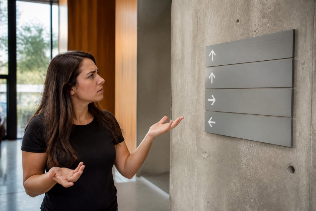
Here’s what most guides miss. Friction isn’t only about reading distance. It’s also about wayfinding. Customers arriving for a specific department, entrance, or service need visual markers that guide them without a staff member’s help. When those markers are missing or misleading, you get people circling the parking lot, calling the front desk, or leaving.
- Illegible text at driving speed kills impulse buying before it starts
- Poor contrast between text and background forces squinting, and squinting feels like work
- Misleading signage sends customers to the wrong entrance, which reads as disorganization
- Missing directional signs increase calls to your front desk and slow everyone down
The Impact of Business Signage on Sales and Conversion Rates
The impact of business signage on sales is direct and measurable at the local level. A clear, well-placed sign raises the number of people who walk through the door; more foot traffic usually means more transactions, because the customer already arrived with intent.
Conversion rates follow the same logic. Once someone is inside, interior graphics and wayfinding keep them moving toward the purchase instead of stalling at a confusing junction. A retail environment with clear aisle markers and department signage moves shoppers faster and reduces the number of abandoned carts caused by simple disorientation.
A Framework for Pricing the Problem
Most signage content stops at “signage matters.” That leaves owners without a number to act on. The useful move is to convert unclear signage into a dollar figure using inputs you already have. The framework below is deliberately simple, it is a way to reason about magnitude, not a forecast.
- Estimate lost walk-ins. Count the customers who arrive at your door and leave without entering, or who call asking for directions because they could not find you. Even a rough weekly count is enough to start.
- Apply your average transaction value. Multiply lost walk-ins by your average sale. That is the recurring revenue the sign is quietly redirecting.
- Add the soft costs. Front-desk calls for directions, staff time spent guiding people to the right entrance, and delivery drivers missing your dock all consume labor hours that a clear sign would return.
- Compare against the one-time cost of the fix. A sign upgrade is a capital expense that recurs once; lost walk-ins recur every week the sign stays unclear. The comparison is rarely close.
Signage is a conversion asset, not a fixed cost. Every dollar spent on legibility and placement is working on your behalf at the curb, in the parking lot, and inside the store, and unlike most marketing spend, it keeps working without a recurring budget.
The Compounding Effect on Repeat Business
A single lost walk-in is a transaction. A pattern of lost walk-ins is a habit, for the customer, the habit of driving past. This is why the sales impact of unclear signage is larger than any one visit suggests. Customers who cannot find you the first time rarely try a second time; they simply route around you.
The reverse also compounds. When a customer finds you easily, parks without circling, and navigates to the right department without asking, the visit feels effortless. Effortless visits become repeat visits, and repeat visits are where local businesses actually make their margin.
Where Brand Consistency Fits
This is also where brand consistency pays off. When a customer sees the same typography, colors, and logo treatment on the exterior sign, the interior graphics, and the vehicle in the lot, the brand feels established. Consistency signals reliability, and reliability is what turns a first visit into a repeat visit. Inconsistent signage, a mismatched font here, an outdated logo there, reads as a business that has changed hands or stopped paying attention, and customers price that perception into whether they return.
Common Signage Mistakes That Cost You Customers
Most signage failures come down to four recurring errors, and each one has a cheap fix.
- Size miscalculation. Signs are sized for the designer’s screen, not the customer’s distance. A sign that looks generous on a monitor can be unreadable from forty feet away.
- Poor placement. The sign sits behind landscaping, under an awning shadow, or above a doorway where nobody looks. Placement should be decided by sightlines from the street, not by what’s convenient for the installer.
- Weak lighting. An unlit sign disappears at dusk, which is exactly when many customers are deciding where to eat, shop, or stop. Lighting design is part of the sign, not an accessory.
- Visual clutter. Too many messages, fonts, and colors compete for attention, and the customer’s eye gives up. One clear message beats five crowded ones.
Skipping a signage audit before a renovation can be a costly mistake. Once walls are closed and permits are filed, repositioning a sign can mean rework, delay, and additional inspections.
ADA Signage Requirements and Accessibility Compliance
ADA signage requirements are the federal accessibility standards that govern how permanent room and wayfinding signs must look and read in public accommodations. They cover things like raised characters, braille, mounting height, and contrast so that people with visual impairments can navigate independently.
The ADA Standards for Accessible Design set the baseline, and the U.S. Access Board guidance on signs explains how those rules apply in practice. For most businesses, the practical takeaway is simple: permanent room signs and directional signage need compliant lettering, tactile characters, and correct placement, and getting it wrong creates both a legal exposure and a customer experience failure.
The Gap Most Signage Content Ignores
This is the angle most signage content skips. Accessibility is not a checkbox for the inspector; it is a wayfinding system for a segment of your customers who will otherwise leave. A customer who cannot find the restroom, the elevator, or the exit does not just have a bad visit, they tell people about it. And the population affected is broader than many owners assume: it includes people with low vision, people with cognitive or neurological differences who rely on predictable, high-contrast wayfinding, older customers, and anyone navigating an unfamiliar building under stress.
What Compliance Actually Requires
The rules that trip up most businesses fall into a few categories:
- Tactile characters. Permanent room signs, restrooms, exits, room numbers, must have raised characters and braille, not just printed text.
- Mounting height and location. Signs must sit at a consistent height and on the latch side of the door so a person can read them without stepping into traffic.
- Contrast and finish. Characters must contrast with the background, and the surface must not be glossy enough to create glare that defeats the contrast.
- Pictograms. Where symbols are used, they must meet the standard’s proportions and be accompanied by compliant text.
Directional and overhead signs follow different rules than room signs. A common mistake is applying room-sign standards to a directional sign, or assuming a sign that looks compliant actually is. Compliance is about measurable dimensions and finishes, not visual impression.
Why This Is a Customer-Experience Issue, Not Just a Legal One
When wayfinding fails, the customer does not blame the building, they blame the business. A visitor who circles the lobby looking for the elevator, or who has to ask a stranger where the restroom is, experiences your space as disorganized. That experience is the one they remember, and it is the one they describe to others. Clear, compliant signage removes that friction for everyone, not only for customers with disabilities.
If you are unsure what your building actually needs, that is a normal starting point. A signage partner should be able to walk your space, identify which signs fall under ADA rules, and specify them correctly rather than handing you a catalog and wishing you luck. The audit checklist later in this article includes the accessibility items to verify first.
Best Practices for Effective Storefront Signs
The best practices for effective storefront signs come down to legibility, contrast, and message discipline. Get those three right and the sign does its job from across the street.
Start with the sightline test. Stand where your customers actually approach from, at driving speed and at walking speed, and ask whether the sign is readable in three seconds. If not, the problem is size, contrast, or clutter, in that order.
Then apply the fundamentals:
- Typography: one or two fonts, sized for the farthest viewing distance, with generous letter spacing
- Color psychology: high contrast between text and background matters more than trendy palettes; dark text on light backgrounds reads fastest at distance
- Lighting design: illuminate the sign so it holds up at night, when a large share of local decisions get made
- Brand identity: keep logo, colors, and voice consistent across exterior, interior, and vehicle graphics
- Maintenance: clean, repair, and replace before fading or burnout becomes the customer’s first impression
Storefront visibility also depends on what’s around the sign, not just the sign itself. Trim the landscaping, clear the window clutter, and make sure the entrance is obvious from the parking lot.
How to Audit Your Current Business Signage
A signage audit is a structured walkthrough of every sign a customer encounters, scored against legibility, placement, and compliance. Run it once a year, and again before any renovation or rebrand.
Here’s a working checklist you can use today:
- Stand at the curb and read the main sign at driving speed. Can you read it in three seconds?
- Check the sign at dusk and after dark. Is it lit, and is the illumination even?
- Walk the customer journey from parking to purchase. Where do you hesitate?
- Photograph every sign and note faded colors, peeling vinyl, or burned-out lamps
- Verify ADA-compliant signs at restrooms, exits, and permanent rooms
- Confirm all locations use the same typography, colors, and logo treatment
- List every sign that a first-time visitor could misread
Score each item as pass, fix, or replace, then prioritize the fixes that touch the customer’s first thirty seconds on site.
| Audit Area | What to Check | Action If It Fails |
|---|---|---|
| Legibility | Readable in 3 seconds at distance | Resize or increase contrast |
| Placement | Clear sightlines from street | Relocate or trim obstructions |
| Lighting | Even illumination after dark | Repair or upgrade fixtures |
| ADA compliance | Tactile and braille room signs | Replace to standard |
| Brand consistency | Matches across all locations | Standardize templates |
Photograph your signs at the same time of day, from the same spots, once a year. Comparing the photos side by side makes fading, drift, and damage obvious long before customers notice.
Unclear signage is one of the few marketing problems you can fix permanently, and the fix pays for itself in recovered foot traffic and fewer lost sales. Triton Sign offers comprehensive design, fabrication, and installation services, with over 30 years of combined experience, ADA-compliant signage expertise, and a proven ability to meet tight construction timelines and budgets. Whether you’re renovating one office or standardizing signage across multiple locations, the team can audit your existing signage, specify what you need, and install it correctly. Contact Triton Sign to schedule a signage audit and get a quote for your next project.
Frequently Asked Questions
What is the number one reason most businesses lose customers?
The top reason businesses lose customers is a poor customer experience, and unclear signage is a major contributor. When people cannot find your entrance, read your hours, or understand what you sell, they leave and go to a competitor. A confusing storefront creates friction before a customer ever walks through the door, which directly reduces foot traffic and conversion rates.
Can poor exterior signage lead to a decrease in foot traffic?
Yes. Poor exterior signage reduces foot traffic because potential customers cannot quickly identify your business, understand your offerings, or find your entrance. If a sign is too small, poorly lit, or cluttered, people walking or driving by will not stop. Consistent, legible signage with clear visual markers helps capture impulse buying traffic and improves storefront visibility.
How does ADA compliance affect customer accessibility and perception?
ADA signage requirements ensure that people with disabilities can navigate your space independently. Non-compliant signs, such as those without braille or with poor contrast, exclude customers and can lead to legal issues. Beyond compliance, accessible signage signals that your business values all customers, which improves brand perception and builds trust with the local community.
How does signage impact the customer experience?
Signage shapes the customer experience from the moment someone approaches your business. Clear wayfinding, readable typography, and consistent brand identity reduce confusion and make people feel welcome. When signs are outdated, misread, or missing, customers feel frustrated and may associate that negative feeling with your brand, reducing customer retention and damaging long-term trust.