Table of Contents
- Why Diverse Vehicle Types Break Brand Consistency (And How to Fix It)
- Vehicle Branding Guidelines: Building a Visual System That Scales
- Vehicle Wrap Design: Adapting Graphics to Different Shapes and Sizes
- Vehicle Wrap Examples: What Cohesive Fleet Graphics Look Like in Practice
- Fleet Branding Best Practices: Templates, Measurements, and Rollout Workflows
- Vinyl Wraps, Decals, or Paint: Choosing the Right Medium for Your Fleet
- Lifecycle Planning: Maintenance, Replacement, and Cost Over Time
- Conclusion: Making Diverse Vehicle Branding Work for Your Fleet
- Frequently Asked Questions
Last Updated: October 13, 2026
Why Diverse Vehicle Types Break Brand Consistency (And How to Fix It)
Designing cohesive branding for diverse vehicle types fails when one design is stretched across every vehicle. A logo sized for a box truck looks lost on a compact sedan.
This guide from Triton Sign covers how to build one visual system that scales across a mixed fleet.
The core problem: a vehicle is a moving billboard with no fixed shape.
Vehicle Branding Guidelines: Building a Visual System That Scales
Vehicle branding guidelines are the written rules controlling how your logo, colors, and type appear on every vehicle. A strong system fixes what stays the same and allows what must flex.
Start with what never changes:
- Your logo and its clear space
- Primary and secondary brand colors
- The two approved typefaces
Then define what can flex:
- Logo size relative to the panel
- How much white space surrounds the mark
- Where contact info sits on larger vehicles
The style guide holds these rules. Keep it short enough that a driver, a printer, and a new hire can follow it, a 40-page guide goes unread.
Separate your rules into “fixed” and “flexible.” Fixed elements protect recognition. Flexible elements let one design fit a van, a truck, and a sedan without a redesign each time.
Logo Placement, Legibility, and Safe Zones by Vehicle Type
Logo placement changes with the vehicle, but the safe zone rule does not. A safe zone is the empty border around your logo that nothing else may enter.
Where to place the logo by vehicle:
- Cargo van: center of the side panel, plus rear doors
- Pickup truck: front doors, with a smaller mark on the tailgate
- Box truck: side panel center, and the front header above the cab
- Sedan: front doors only, kept small and clean
Legibility is the test: a logo that reads clearly from 20 feet works; one that requires walking up close does not.
Color Palettes and Typography That Hold Up on the Road
Color and type decide whether your graphics read at speed. A palette that looks sharp on screen can wash out in sunlight or vanish on a dark vehicle.
Rules that hold up in practice:
- Use no more than three colors, including white
- Keep strong contrast between text and background
- Avoid thin fonts; they blur at distance
Contrast matters more than color choice. Dark text on a light panel reads best. Light text on a dark panel works too. Mid-tone on mid-tone fails every time.
Vehicle Wrap Design: Adapting Graphics to Different Shapes and Sizes
Vehicle wrap design fits your brand graphics to each vehicle’s actual panels, curves, and windows.
Doors, wheel wells, and fuel caps interrupt flat panels, so a design that ignores them looks chopped up. Map each vehicle before designing.
A simple adaptation framework for mixed fleets:
- Photograph each vehicle type from all four sides
- Mark the usable flat panels on each photo
- Note the curves, handles, and cutouts to avoid
- Place your fixed elements first, then fill the rest
- Scale graphics to the panel, never the other way around
This is the part most guides miss. You are not shrinking one design. You are rebuilding it inside each vehicle’s real boundaries.
Build a separate template for every vehicle class in your fleet. A template is a marked-up photo showing safe zones and cutouts. Five templates cover most mixed fleets, and they save hours on every future job.
Vehicle Wrap Examples: What Cohesive Fleet Graphics Look Like in Practice
Cohesive fleet graphics share traits you can spot at a glance: the logo sits in the same relative spot on every vehicle, colors match across light and dark surfaces, and type stays the same size relative to the panel.
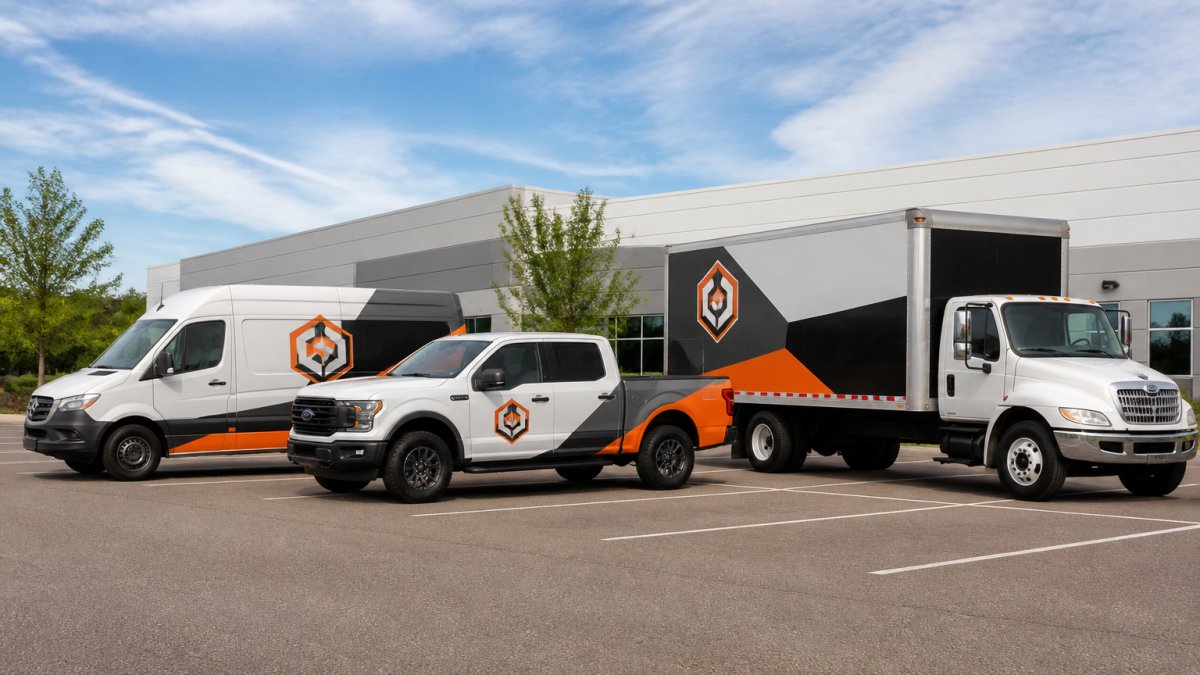
Walk past a well-branded fleet and you notice the pattern, not any single vehicle. A van, a truck, and a sedan should read as one family even though their shapes differ.
Vehicle-Specific Safe Zones and Panel Notes
Most guides stop at “put the logo on the door.” The real work is knowing which surfaces are usable, which are blocked, and how much room you have. The notes below reflect common fleet configurations; measure your own units before finalizing artwork.
- Cargo van (full-size, e.g., Ford Transit, Mercedes Sprinter, Ram ProMaster): The long side panel between the front door and rear wheel arch is the primary canvas, typically 8 to 10 feet of usable length and 4 to 5 feet of height on a high-roof model. The sliding door seam, fuel door, and side trim break the panel into segments. Keep the logo in the forward third of the side panel so it stays clear of the sliding door track. Rear doors offer a second placement, but the vertical seam between them will cut through any centered mark.
- Pickup truck (e.g., Ford F-150, Chevrolet Silverado): Front doors are the reliable placement, roughly 3 feet wide by 3 feet tall of usable area. The bed side is interrupted by the wheel arch and fuel door, so a full-length side graphic must be designed around those cutouts. The tailgate is a strong secondary surface, but the handle and backup camera housing sit in the upper center.
- Box truck (e.g., 16- to 26-foot straight truck): The side of the box is the largest uninterrupted surface in most fleets, often 16 to 24 feet long and 7 to 8 feet tall. The cab doors still need a logo for close-range recognition. The header above the cab is a high-visibility spot but is often curved, so flat artwork will distort there.
Reading the Sightlines
A vehicle is viewed from three main angles, each favoring different artwork:
- Side view at speed, the longest viewing window. Logo and one short message only.
- Rear view in traffic, the most repeated view. Put a phone number, website, or QR code here.
- Front and three-quarter view, the shortest viewing window. A hood or front-door mark is enough.
Treat the side panel as the primary brand surface, the rear as the call-to-action surface, and the front as the recognition surface.
What to copy from good examples:
- One logo position repeated across all vehicle types
- A color scheme that works on every base color
- A clear hierarchy: logo first, message second, contact third
Fleet Branding Best Practices: Templates, Measurements, and Rollout Workflows
Fleet branding best practices come down to templates, measurements, and a rollout plan. Templates keep every vehicle on the same system, measurements make graphics fit the first time, and a rollout workflow keeps a growing fleet from drifting off brand.
A basic rollout workflow:
- Approve the style guide before any vehicle is wrapped
- Build one template per vehicle class
- Measure each vehicle and record panel sizes
Readability Testing and Viewing-Distance Checks
Readability testing tells you whether your graphics work before you spend on a full fleet. Test at the distances your audience actually sees the vehicle.
How to run a viewing-distance check:
- Print a small proof of the design
- View it from various distances
- If the logo blurs, make it bigger
- If the message is unreadable, simplify it
- Check the design in bright sun and in shade
Most teams skip this and find the problem after installation. Testing can save a reprint.
Vinyl Wraps, Decals, or Paint: Choosing the Right Medium for Your Fleet
Vinyl wraps, decals, and paint each fit different needs. Vinyl wrap covers large areas with full-color graphics, decals are cut shapes best for logos and simple text, and paint is the most permanent but least flexible.
| Medium | Coverage | Best For | Changeability |
|---|---|---|---|
| Vinyl wrap | Full or partial panels | Full-color fleet graphics | Removable, updatable |
| Vinyl decals | Logo and text only | Simple, low-cost branding | Easy to replace |
| Paint | Whole vehicle | Long-term, single-color look | Hard to change |
For most mixed fleets, vinyl wrap gives the best balance: it handles detailed graphics, protects the paint underneath, and can be updated when your brand changes.
Do not mix media across one fleet without a plan. A wrapped van next to a decal-only truck looks mismatched even when the colors match. Pick one primary medium and use it consistently.
Lifecycle Planning: Maintenance, Replacement, and Cost Over Time
Vehicle graphics do not last forever. Planning maintenance and replacement keeps your fleet looking sharp and the cost predictable instead of landing in one budget year. Most fleet managers focus on upfront cost and ignore total cost of ownership.
Expected Service Life by Medium
Service life depends on film quality, sun exposure, climate, and wash frequency. These ranges reflect professionally installed graphics on daily-use vehicles.
- Cast vinyl wrap with laminate: typically 5 to 7 years on vertical surfaces, 3 to 5 years on horizontal surfaces like hoods and roofs where UV exposure is highest.
- Calendared vinyl (economy film): often 2 to 3 years before noticeable fading or shrinkage. Cheaper upfront, but the replacement cycle is roughly twice as fast.
- Cut vinyl decals: 3 to 5 years for solid-color film, less for thin or intricate cuts that catch edges.
Maintenance That Extends Life
- Wash graphics by hand or with a touch-free wash. Brush washes and high-pressure wands at close range lift edges.
- Avoid waxing directly on matte or textured laminate; use a manufacturer-approved cleaner.
- Inspect for peeling edges, lifting corners, and bubbling every few months, especially after winter.
Replacement Cycles and Budgeting
A rolling replacement schedule is the most useful tool here: stagger replacements instead of replacing the whole fleet at once, so no single year carries the full cost.
A simple approach:
- Record the install date and expected life for every wrapped vehicle.
- Group vehicles into replacement waves by install year.
- Budget the replacement cost into the year before the wrap is expected to fail.
- When a vehicle is scheduled for mechanical replacement, time the wrap refresh to the same window so you only take it out of service once.
When to Refresh the Design, Not Just the Film
A reprint is the moment to decide whether you are replacing the same artwork or updating it. If your logo, colors, or contact info changed since the last install, a straight reprint locks in the old brand for another full cycle. Build a design review into every replacement wave so the fleet stays current without a separate rebrand project.
Conclusion: Making Diverse Vehicle Branding Work for Your Fleet
The hard part of vehicle branding is not the design. It is keeping that design consistent across every shape, size, and surface in your fleet.
That is where a partner handling design, fabrication, and installation under one roof makes the difference. Triton Sign brings over 30 years of combined experience to fleet graphics, with full-service design, in-house fabrication, and reliable installation that meets tight deadlines and budgets.
Get started with Triton Sign and give every vehicle in your fleet one clear, consistent brand.
Frequently Asked Questions
How do you keep branding consistent across different vehicle types?
Start with a written vehicle branding guidelines document that locks in your logo, color palette, typography, and safe zones. Then create vehicle-specific templates for each type in your fleet, whether that’s a cargo van, box truck, or pickup. The key is to keep the core elements identical while letting the layout flex to fit each vehicle’s proportions. Test readability before finalizing any design.
What should a vehicle branding style guide include?
A solid style guide covers logo placement rules, minimum clear space around the logo, approved color values (Pantone, CMYK, and RGB), font families and sizes, and safe zones that account for door handles, windows, and body curves. Include vehicle-specific templates for every type in your fleet, plus examples of what not to do. This document keeps every wrap, decal, or paint job consistent no matter which vehicle it goes on.
How do you adapt a logo and graphics to different vehicle shapes?
Map out the safe zones on each vehicle first. A box truck has large flat panels; a cargo van has curved surfaces and limited flat space. Scale your logo to fit within those zones without stretching or distorting it. On smaller vehicles, drop secondary elements like taglines or phone numbers and keep only the logo and primary brand color. The goal is instant recognition, not cramming every detail onto every surface.
What colors work best for fleet vehicle graphics?
High-contrast combinations work best for road visibility. Dark text on a light background or light text on a dark background both perform well. Avoid low-contrast pairings like navy and black or red and orange. Your brand colors should lead, but you can use a neutral base (white, silver, or gray) on larger vehicles to keep the design from feeling overwhelming. Always check how your colors look in direct sunlight and overcast conditions.